UNIT 52
RESIDENTIAL
Located in one of the first skyscrapers in Spain, in the emblematic expansion area of Valencia, this home offers an impressive panoramic view from its rooftop, where the most iconic points of the city can be appreciated. Built in 1960 and representing the International Style, the challenge of the interior renovation was to preserve the mid-century spirit of the building while adapting it to contemporary needs.
With an area of approximately 165 m², the apartment is located on a corner, which gives the room with the best orientation an irregular shape. This particularity, along with the robust pillars that form two very marked axes within the space, influenced the overall layout. To honor the heritage of the Modern Movement, the decision was made to expose the structure, revealing the large section reinforced concrete pillars that, with a subtle brutalist touch, bring great expressiveness to the home.
Following the philosophy of Miguel Milá, who stated that his design was “purist, rationalist, with contained aestheticism, aiming to improve what is already present,” this is what we aimed to convey in this home. The rest of the house was designed in neutral tones to enhance the character provided by the exposed pillars, stripping it of any unnecessary ornamentation.
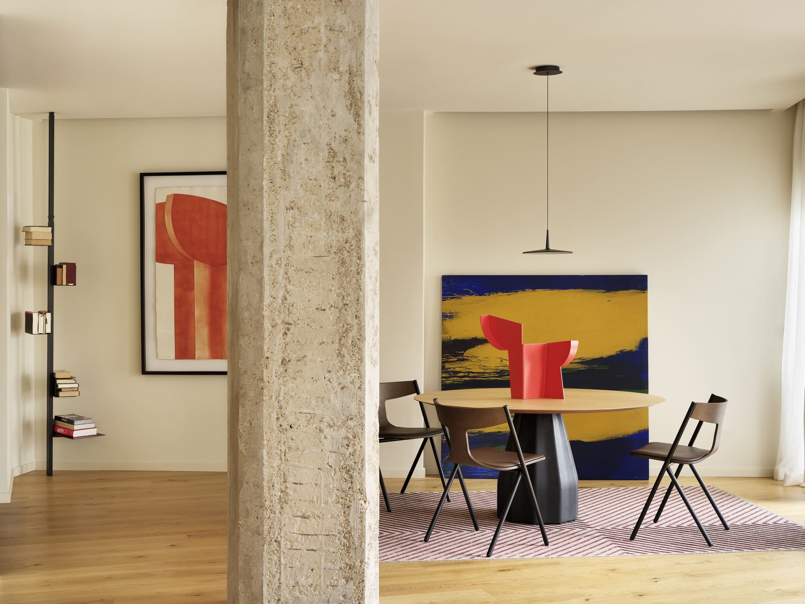
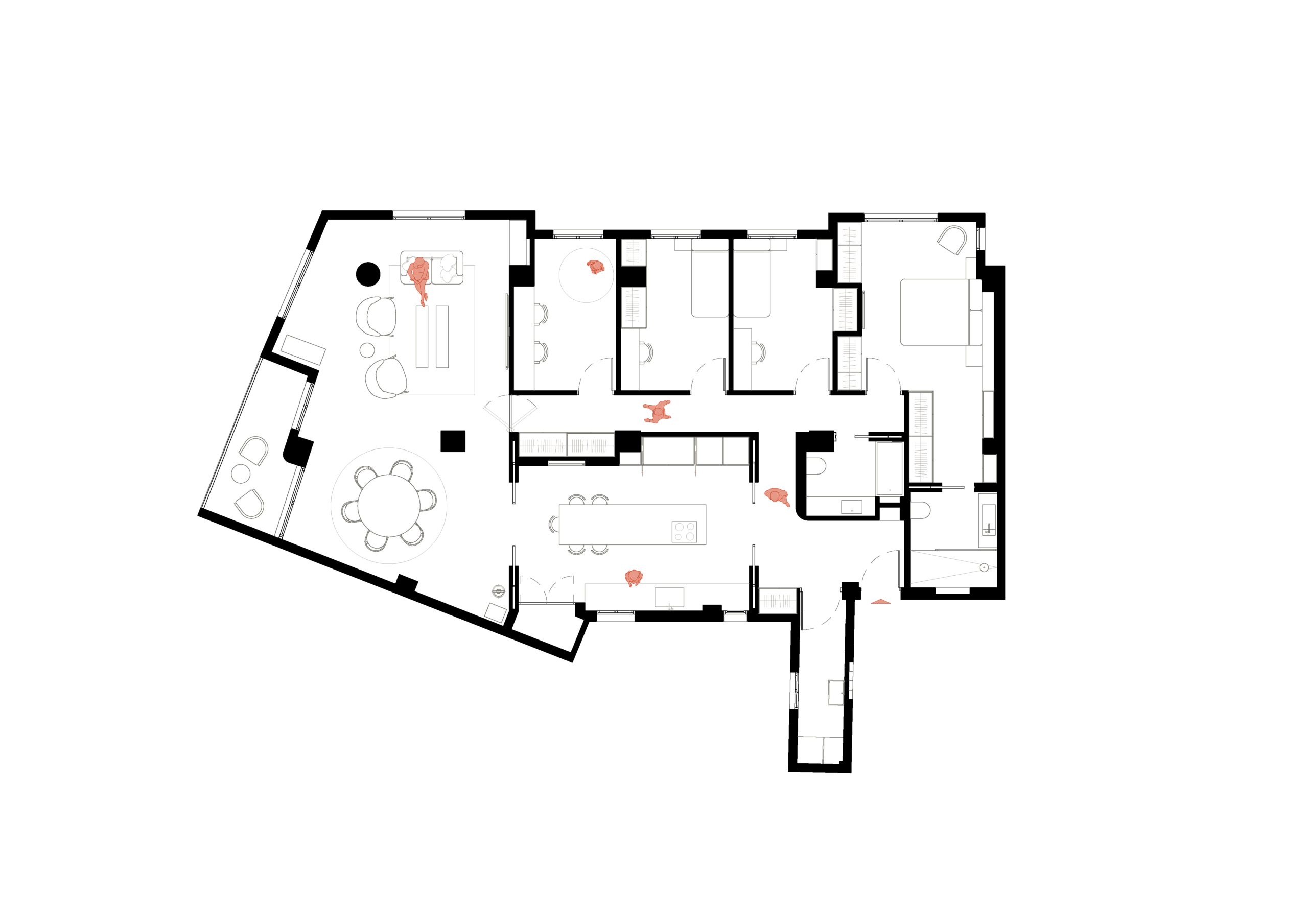
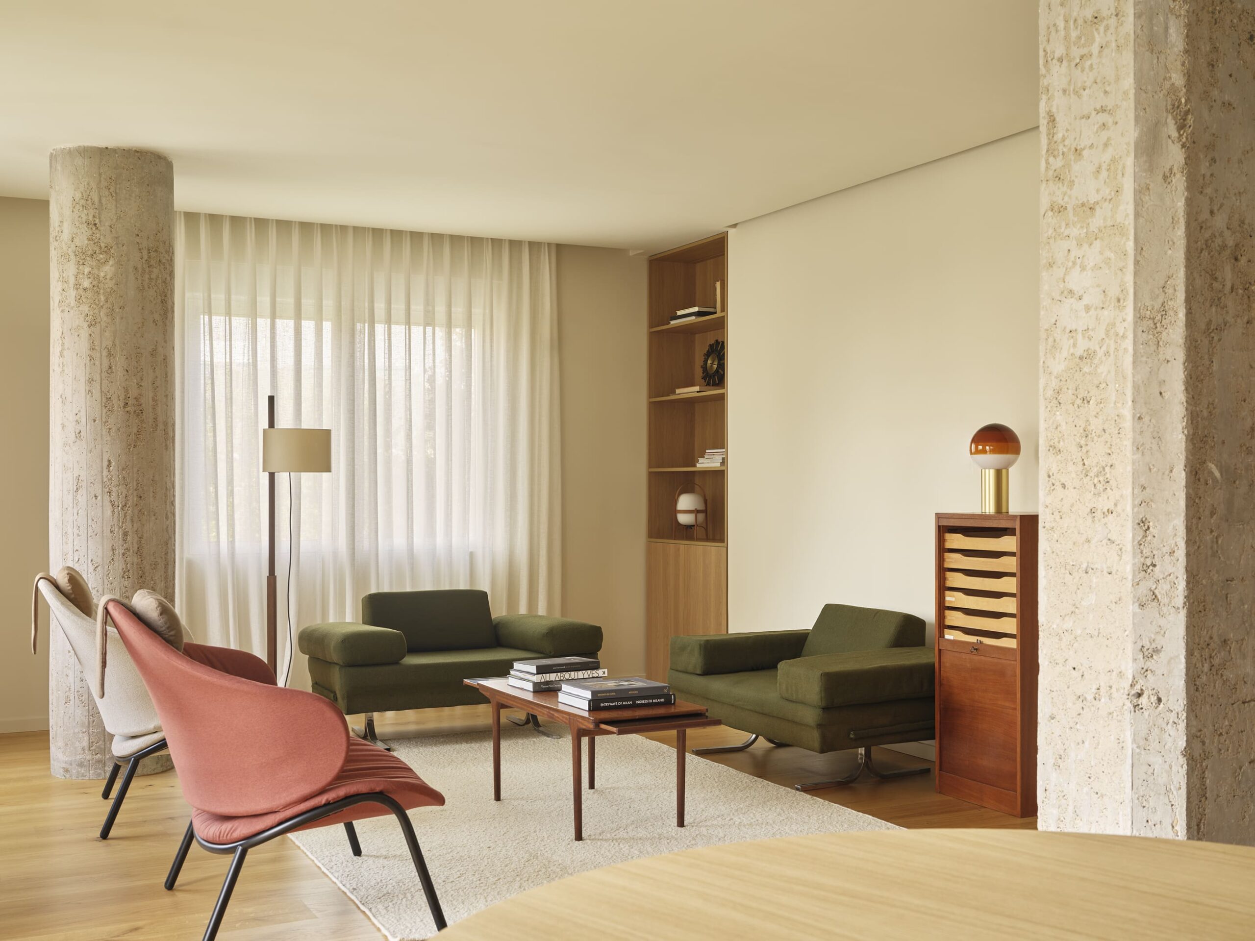
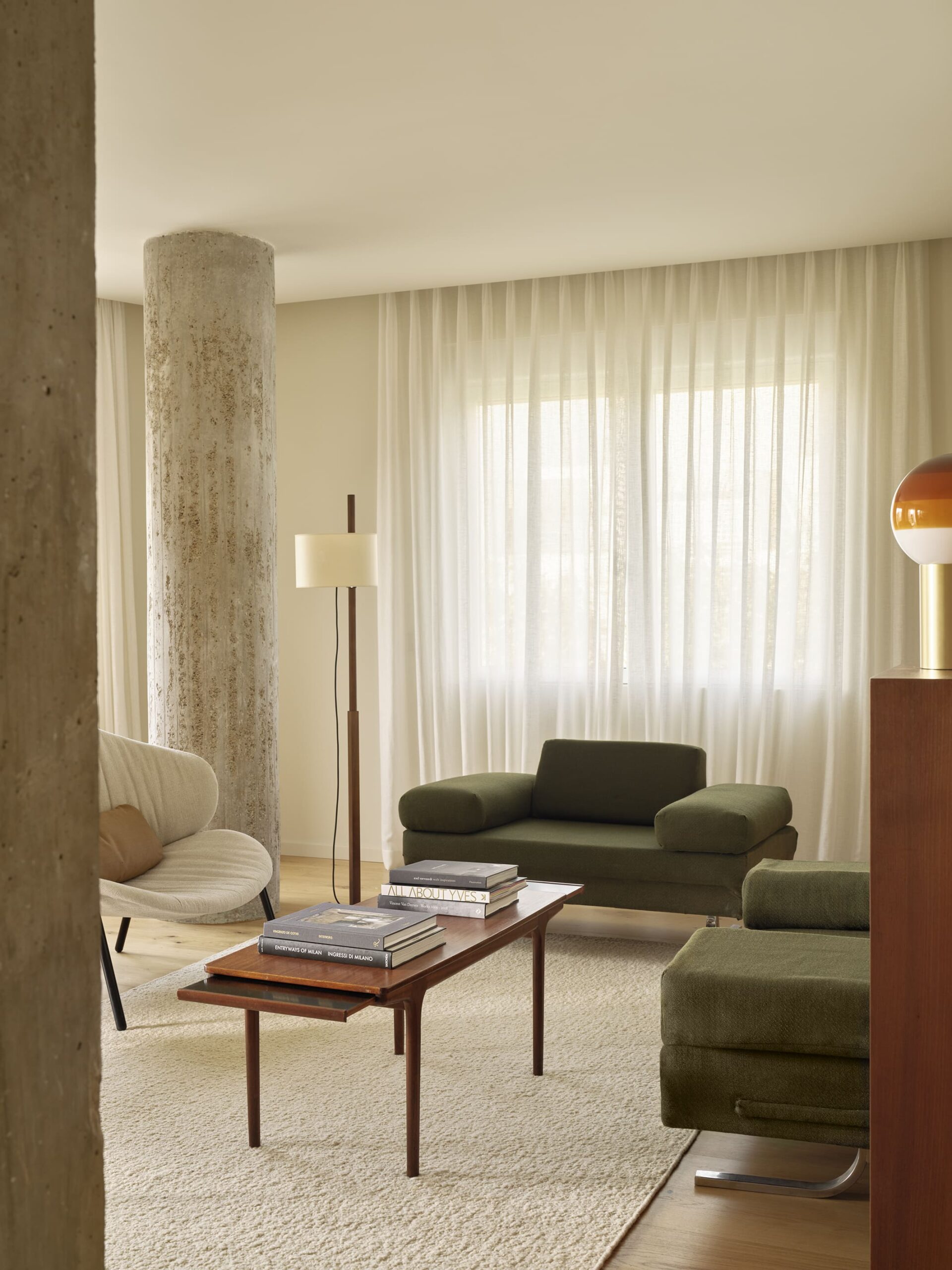
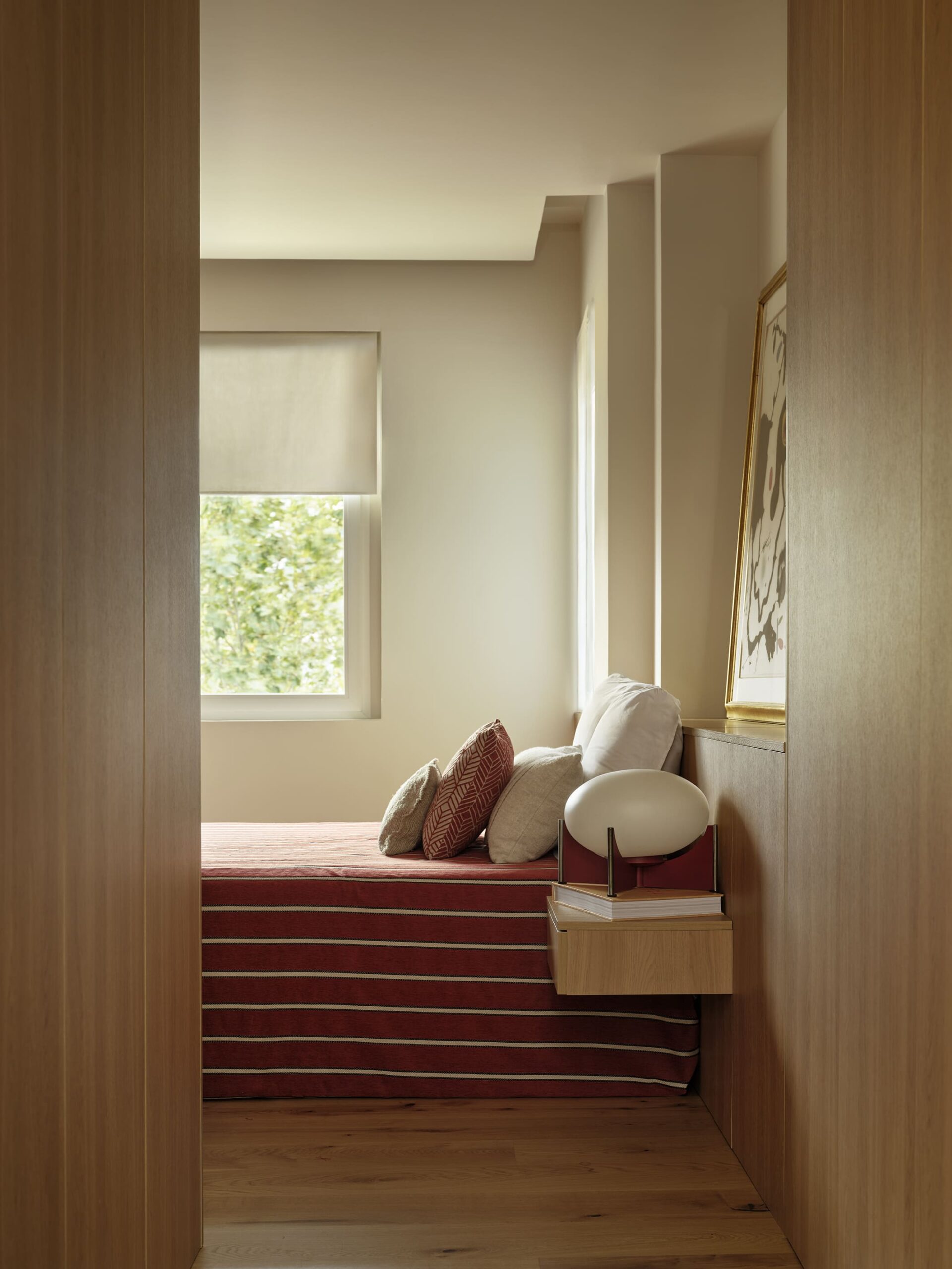
The family, consisting of two adults and three children, required that all the bedrooms be located on one of the main facades, leaving the day zone on the corner facade.
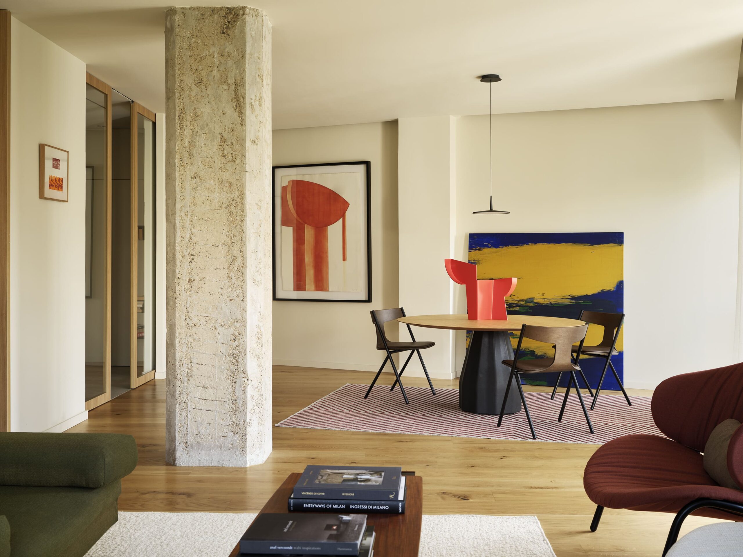
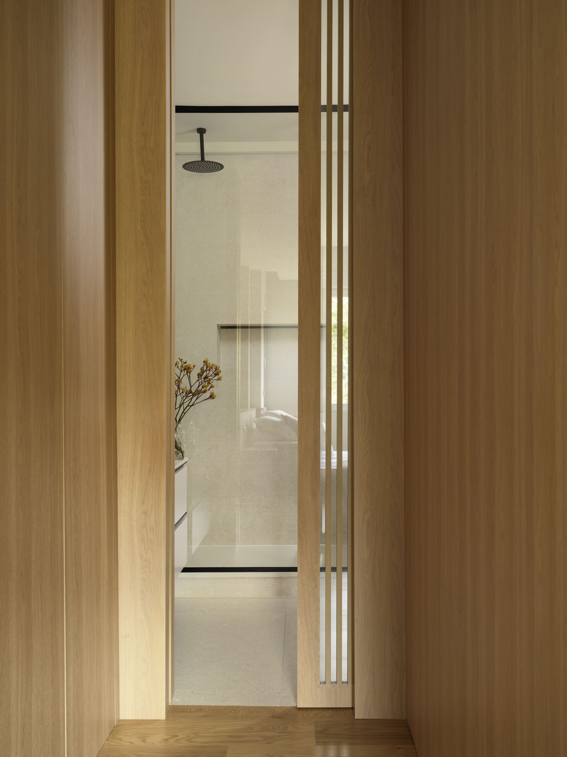
Additionally, the kitchen had to be an independent yet versatile space, facilitating communication with the rest of the home. To achieve this, a kitchen was designed to act as a filter between the entrance and the living area, with two pairs of sliding glass doors framed in oak wood.
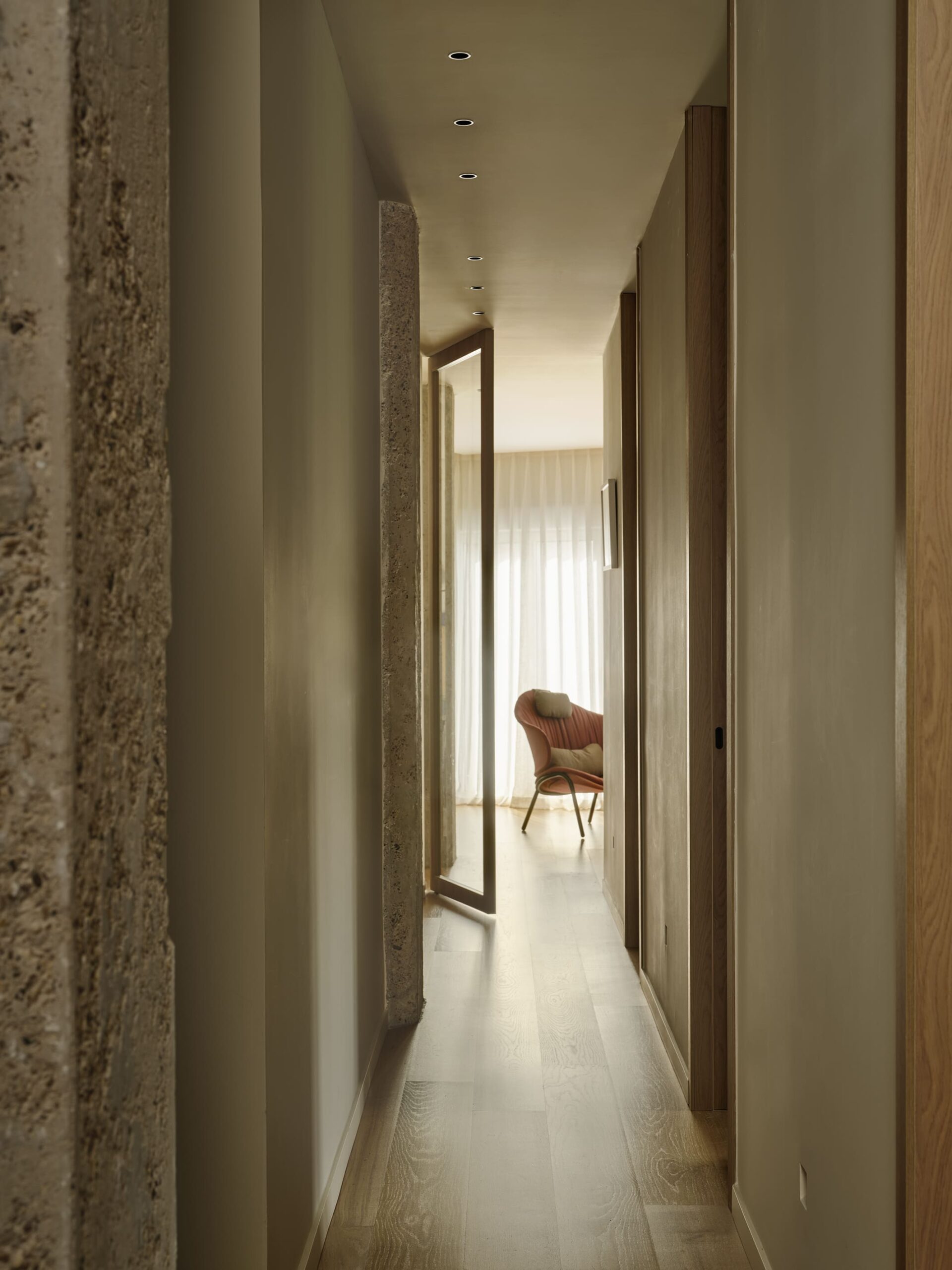
These doors connect the hallway with the living-dining room, allowing smooth circulation when open and ensuring the kitchen’s independence when closed.
This solution not only allows for fluid circulation but also floods the hallway with natural light, which had previously been a dark area.
The kitchen design includes a large island with a custom-made table, organizing the space and hiding the appliances behind oak wood panels, just like the rest of the home.
In the hallway, another oak wood panel hides a wardrobe and laundry area. The latter has been integrated here to maximize space usage, as it was a small annex that protruded from the general floor plan of the house. The curve of the entrance guides us towards the hallway and, thus, the night zone, in a more organic manner to avoid a sharp corner in such a small space and to soften circulation once entering the home.
The hallway continues behind the kitchen through another oak wood paneling to maintain aesthetic coherence with all the carpentry throughout the house, which runs through all the rooms, with floor-to-ceiling doors, until reaching the living room, which is accessed through a pivoting door with the same characteristics as the kitchen doors, bringing natural light to the entire hallway.
In the master bedroom, once again, wood takes center stage, as a headboard with built-in storage, custom-designed along with the cantilevered nightstands, creates a visual continuity leading to the walk-in closet. The latter is also designed with oak wood paneling until reaching a custom-designed slatted sliding door, which conceals the en-suite bathroom.
The master bathroom is presented as a monochromatic sanctuary in beige tones, with ambient lighting, aiming to convey the serenity and well-being reminiscent of a spa.
In the children’s bathroom, we wanted to maintain the sobriety of the rest of the house while adding a splash of color to make it more attractive to them. We were inspired by the green color of the mosaic that covers the balcony facades of the building.
Photographer: Germán Sáiz
Styling: Ángela Esteban Librero